Saturday, November 27, 2010

Design in Society : Utopian Design


Utopian designs not only aim to be “perfect,” but also to be beneficial to society and its users. We see many designs today that already exhibit the factors of beauty and usefulness, but which ones aim to improve society? Utopian designs can be created by taking a design that already exists, and improving and adding factors or functions that works to develop it.
The bike in the above image, for example, works like any other bike. But the red disk on its wheel is a hybrid battery-powered disk that turns it into an “electric boosted bike,” making it easier for users to ride uphill. A simple explanation for its use is that“the wheel generates energy from the brakes and stores them in batteries for later use by the motors” (Alan G. Brake, The Architects Newspaper Blog). With the red disk added to the design, it makes this bike stand out among the other bikes because its user can use it more efficiently. Because these bikes have a wheel that has functions similar to a hybrid car, it encourages people to use these instead of cars. Biking is beneficial to society because it helps people stay healthy.
Many designs have a purpose in its design, and the Utopian designers’ purpose is to create ideal products that will be enjoyed and beneficial to people around the world.

Color Transforms

Photo Link:

 
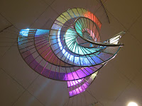
Color is a powerful tool in design because it gives design variety and adds beauty and life to the design. Without color, everything would either be black or white.
The above image shows a glass sculpture beautified by the colorful lighting it displays. If the colors were to be gone, all we would see is the regular clear glass and the sculpture with no magnificent appeal to it. But adding colors gives us a whole different view because “without color, il disegno may be called a body without a soul,” quoting from Marco Boschini. The colors established here range from primary colors of blue, yellow, and red to other colors created as a result of mixing. But the sculpture doesn’t display just one form of color. There is a wide range of values for these colors, and because these colors are displayed through lighting, the value effect is even greater. But the colors that we see all comes from white light because it is what contains all the colors of the spectrum. If white stands alone, there won't be much to look at, but white is also important because it creates all the other colors that we see. While white generates value changes that makes a color lighter, black also helps create values as it makes a color darker. The blue light in the sculpture, for example, exhibits both light and dark values of blue, and is what brings diversity into a single form of color.
Designs do not need to exhibit colors, but colors can transform the design to make it look appealing. In design society today, almost everything have some form of color, whether it adds to variety or beautifies the product.

Dangerous Designs

Photo Link:
 
Designs are created the way they are for a variety of reasons, but none of them aims to be dangerous. In our design society today, many items can be beautiful and appealing to the eye, but also dangerous at the same time.
The pink high heel, for example, is great to collect and add to women’s shoe collection, but when wearing the heel, it can be dangerous because the heel is a few inches high and can cause pain to the consumer who uses this. Wearing certain types of heels damages one’s health as it causes foot and ankle problems, and if one isn’t careful, they may also trip while wearing these. To some women, heels may be appealing, but wearing it for a long time generates foot problems that may last a long time. Aside from the side effects of wearing heels, the shoe can also be used as a weapon because of its sharp heel and heavy weight.
Many styles of high heels exist, and many of its designer aim to fix the problem of foot damage when wearing heels. This danger is an unintentional consequence because when consumer items are designed, designers have to consider the needs of consumer in order for it to appeal to them.The three straps on the high heel, for example, aims to allow consumers to keep ones foot in the shoe, and the many sizes that are available aims to make sure people's foot fit in just right so that they will not suffer from shoes that are to tight or too loose. So although designers do create products that generate some form of danger, the overall intention of the design was meant to be appealing and comfortable to its consumers. And it is through these flaws in designs that allow designers to look for ways to improve and develop their designs into something better.


Saturday, November 13, 2010

Ergonomics Design

Photo Link: http://www.squidoo.com/funkychairs


Ergonomic is the science of equipment design that is intended to provide comfort to users. There are five steps in ergonomic research, of which are safety, comfort, ease of use, performance, and aesthetics. Through ergonomic designs, designers interact with users by thinking about their needs, which gives them ideas on how to improve equipments to maximize their productivity.
The first step of the research is safety, and this would be the step considered first. Safe equipments are something consumers would look to buy. The white orchid chair in the image above, for example, fulfills the step of safety as the chair is proportionally balanced to not allow the chair to tip over. It has stable leg holders at the back, of which are connected, while the two in the front are separate.
The second step of the research is comfort. In looking at the above chair, it exhibits a form of comfort with its lowness, giving people a time where they can “lie low” and relax. I’ve never sat on one, but from its image, I do notice that the back rest of the chair is curved inside to allow ones back to lean on, while the head can lie itself on the chair as the top back of the chair is curved back. The seat is also not the typical flat seat we see on most chairs but is also curved like an arch, where the legs can rest as well.
The third step would be ease of use, and this chair portrays this with its low height so that anyone can use it. There is no difficulty in using this chair because one just has to lie down and relax. Other than its low height, the weight of the chair may also be lighter because it’s not as big/tall as other chairs.
The fourth step would be performance, or productivity. How well does the equipment work? Does the chair tip over to one side because it’s imbalanced? Designers consider the performance of their equipments as well because they want people to use it without a hard time.
Many designs in society have successfully completed the first four steps, as designers work their way into the level of aesthetics, the philosophy of beautiful. Some designs may exhibit this, while others may have focused on just the first four steps. But in the white orchid chair, its designer shows aesthetics in the design by modeling the chair after an orchid flower. It’s not the typical flat, four legged chair that we may see everywhere. The chair is also white, which may express a form of calmness, as one would find while relaxing on the chair itself.
Designers often think about their users when they design something because this is their purpose in creating equipments. It won’t be a good design if it’s not appreciated by their users, so designers work very hard to achieve their goals. The most basic step to consider is safety, and after they’ve accomplished this step, they can then move on to considering the other aspects of ergonomic designing. Ergonomic design is pretty successful in our design society today because designers are creating objects that are both safe and beautiful so that it will appeal to the people.

Patterns


Photo Link: 


Patterns can be seen almost everywhere and are usually easy to recognize because it involves repetition of design elements, such as units or shapes. In the process of creating patterns, designers may focus on harmony, proportion, as well as symmetry so that the elements used will not disrupt the design as it dominates over another.
In the blue quilt above, for example, the designer uses two types of shapes and uses them repeatedly throughout the design. It is symmetrically divided so that if we were to fold it in half, both sides would be the same. Patterns don’t always have to apply to symmetry, but in some designs, it is usually seen. Pattern is about repetition and by using this method, designers create a harmony of different elements in which no one unit is emphasized over another. Shape sizes do not have to be the same, but there needs to be a repeated use of the same element so that the design will not just be many units placed together. Proportion is also seen in this blue quilt as the quilt is divided in to grids, with the circular-star shapes on the intersections of the grids itself while the square elements lie in-between in the boxes of grids so that each square is surrounded by four circular-star shapes. Proportion gives us a sense of unity by showing how the design is balanced.
Patterns are often used in design because by combining several of the same elements together, it creates a visual form. There are many way patterns may take form because in the design society, patterns are usually seen in many unique ways and can even be only just a small part of the design. There may be many different patterns all connected in a design, but there must be repetition for patterns to take place.

Saturday, November 6, 2010

Word and Image in Design

Photo Link: http://obamashirts.wordpress.com/2008/11/01/obama-retro-time-for-change-t-shirt/


Words and images often combine together to give out a message. Some designs uses the technique of additive combination and interdependence to produce a certain effect. Interdependence means, as Scott McCloud says in “Understanding Comics,” that words and pictures go hand in hand to convey an idea that neither could convey alone, while additive combination is the use of words/images to elaborate images/words.
In the words are taken out of the image of the t-shirt on the left, for example, we would not know what Obama, the person in the image, would be saying (message). By having the words, it directs to us a message that we all notice at one glance. And if we took out the picture of Obama, then we would not know who is saying the phrase. In this case, the two rely on each other to fully get the message out. Additive combination is also used here through the colors and background images. The colors red, white, and blue, for example, enhances the idea that it’s related to the nation of America, while the stars represent the part of the U.S flag.
Words work with images to achieve a goal to attract the attention of their viewers. Some images may not need words at all because it can stand alone to convey its messages, which goes the same for words. But in some cases, words and images work together in a design setting that quickly allows us to establish the message. Designs in society often uses imagery and words to convey their meaning, but also uses just words or just imagery to deliver their purpose. In the design world, there is a variety of ways to deliver a message, but it depends on how effective the message can be sent out through the methods.

Word and Image in Comics

Photo Link: http://momscancer.blogspot.com/2007_03_01_archive.html


Brian Flies, the author of “Mom’s Cancer” and “Whatever Happened to the World of Tomorrow” speaks about the combination of words and pictures/drawings that together creates a comic book. He believes that neither fully tells the story without the other.
In comics, we often see words and images together, allowing us to better understand the plot of the story. Words and images may be balanced or they may have different statuses. For example, pictures could tell as much as words say, but sometimes pictures give more information to the reader while at other times, words may make more sense to viewers. The above image is a page from Brian Flies’s comic book, “Mom’s Cancer.” Without the boxes of words to give explanation, we would not know what it going on. Without the image, the words may not produce the same effect as it would when combined together with the image.
This is also so in a design setting. Sometimes we are able to get the full view just by looking at the design itself. But other times, without the explanation from its designer, we may have a hard time interpreting what the message is. This not only goes for comics, but also the designs in society. If the message isn't effectively portrayed, then the work may lose a great deal of its appeal because the message becomes lost.

Aesthetics

Photo Link: http://www.nwvle.net/mod/resource/view.php?id=1797


Aesthetics is the philosophy of the beautiful, and can be seen in many designs. As Goethe says, “feeling is all” and this is what aesthetics is all about. It deals with the nature of beauty and art in designs.
The image on the left shows the idea of aesthetics through a three dimensional sculpture set in a surrounding filled with nature. The silver and sparkling appearance of the sculpture brings out the beauty as the sculpture produces a shiny texture and surface. The two figures look like they are enjoying the nature around them as they spread their arms to fill the space. This may be an indication of expression, as the two figures cross their legs against each other and spread their arms wide open, as to incorporate everything around them. Simplicity is also shown as the two people are simplified to a degree in which we recognize them as human figures because of the head and body with legs and arms it possesses. Other than that, feet, hands, and head, are replaced by a spherical shape with no specific facial feature of human characteristics.
Aesthetics expresses art/design in a way that captivates the visual or sensual feeling of viewers. If viewers take more than a glance to look at something, or are amazed by a certain design, then designers have achieved their purpose in creating an aesthetic design/art. The designs in society we see are usually filled with aesthetic images or words, and they all aim to achieve the purpose of capturing our attention.

Saturday, October 30, 2010

Interaction of Content and Form in Objectified

Photo Link: http://www.thefoodsection.com/foodsection/2003/08/shopping_list_p.html


In objectified, the film tells us that simple objects we use everyday are created for both form and function. There is always a purpose for exhibiting the form it shows. Many designers don’t just create something because it looks good. They consider the content and form so that they’ll achieve their desired purpose in creating something which is useful, comfortable, and/or beautiful. And in combining form and content together, we get what is called a concept.
Form includes the materials used and the principles of design, while content is the subject matter, as it tells what designer wants to communicate. In form, designers focus on the balance, proportion, or texture of the object. For example, a peeler exhibits its many form not just for the purpose of visual view, but also to allow people to get a more comfortable grip when they are using the tool. To get the comfortable grip, designers use things such as rubber to cover around the sharp edges so that users would not hurt their hands. Designers then have to decide the shape and size of the peeler in considering which type or size would best suit their consumers. By combining the form and content together, designers create an object that has achieved its purpose.
What do designers consider when they are making something? Industrial designers want us to enjoy using their peelers, or any other object, that they designed through hard effort, and get a comfortable grip that makes using it more efficient. In combining form and content together, designers create this concept based off the idea that they want to make something which is useful and comfortable to the consumer. This idea is seen in many designs of society as almost everything seems to have a purpose in its existence.

Mass Produced Object of Industrial Design


                                                                                                                                                                              Photo Link (left): http://www.007swz.com/ronhefen/products/shaopiao_66.html


Designs, such as spoons, have been mass produced all over the hardware industries. Although mass production gives us the idea that every object is identical, there are various objects of the same type with different designs that aim to achieve a specific goal. Some designers, for example, create spoons just for utility purposes, while others seek ways to incorporate visual effects into the utility itself. In considering its purpose, design usually involves the variety of shape and form that gives the difference in spoons we see today.
Almost everything we see exhibits a shape, or form. Shapes and designs of spoons can range in various forms depending on the designer. It can be fancy, or it can be something as simple as the spoon in the left picture above. This spoon has a simple handle with no given fancy designs, while every bowl of spoons is shaped into a three-dimensional semi-circle. Although spoons are mass produced hardware, it can come in many different sizes and designs, such as the spoons in the right image, which exhibits a bowl ranging from ovals with sharp tips, curved tips, or wavy edges. The tips of the handle are also incorporated with design to produce a visual effect that makes it different from all the ordinary spoons. Whatever their designs are, all spoons are curved at the bottom to serve the purpose of a scooping utility.
In industrial designing, proportion and balance are usually incorporated because the designer not only goes for how the object will look, but also how well it functions. The size and shapes of spoons are what they are because designers consider the convenience of its use when designing it. Different sized spoons are created either for the different hand sizes or for the purpose of scooping different sized food. The bowls of the spoon all exhibit a roundish shape because that would best fit into our mouths comfortably. From narrow to wide spoon handles, large to small bowls of the spoon, the designer considers all aspects of its use to design something that will be efficient and comfortable to the consumer when it’s being used.
Different designs in mass production bring out the uniqueness of each spoon, whether designed to achieve fanciness or simplicity. Differences in forms of industrial designs are created to improve the daily lives of people as designers constantly look for ways to enhance an ordinary idea for the benefit of their consumers. Design is about people, and so one way designers connect to society is by thinking of designing things that will satisfy the people.

Colors

 Photo Link: http://empiremagic.com/index.php?l=t&pageStewardLink=6418
 
Colors are created through the change of lights. We see colors everywhere in the world, ranging from a value of light to darker colors. Even one specific color, such as blue, has a variety of blue that goes from light to dark. Although there are many different colors around the world, there are only three primary colors of red, blue, and yellow. By mixing any of these colors together, new colors known as secondary colors are produced. Colors can be mixed together to produce the numerous forms of colors that we see today in many of the designs.
The image above, for example, shows different colored scarves. We see around three forms of blue in the picture. To get the sky bluish color, we can tint the original form of blue by mixing it with white. If we wanted a darker color, we could shade the original blue by mixing it with black. Mixing the amount of white or black will determine how dark or how light the color of something will be. Colors are very diverse because using the three primary colors,mixing can produce a lot of the different colors we are able to see.
From the image above, we also see two scarves of which are white and black. White and black are useful when we want to have a change in values of color. White contains all colors, and creates the different colors we see as it reflects all of them. Black, on the other hand, absorbs all the rays of color. We use both these colors to create what we know as dark or light. Any color added with white will lighten the color, while anything added with black will darken it. Without white, colors would probably not exist because colors are reflected off white.
When we see designs, there are usually a variety of colors that constitute them. It creates variety, such as the variety of color scarves, even though it all originates from one idea. In many designs of society, we often see many that have colors combined together to give us various designs, whether using just one color, or many colors. Designs have diversity because color adds a different feel, whether to the person buying the item/design or to the item/design itself.

Sunday, October 17, 2010

Comparing and Contrasting


(left) Photo Link: http://www.mysmokingshop.co.uk/index2.php?mod=mancats&man=253&sec=1500
(right) Photo Link: http://www.dejarpipes.com/newhyperlinks/5710.htm


There are many different forms of an object that have originated since its original form first appeared. This is the power of design. It takes an original product and through the ideas and creativity of many people, different forms are created. What’s similar about these pipes? What’s different?
The similarities I see are that they are both briar pipes with a black mouth piece that’s used for smoking. Aside from this, their shapes and structure is very different from each other. On the left is a manufactured briar pipe made by the Royal Dutch Pipe Factory. Although its stem and bowl is brown like the pipe on the right, it exhibits a darker brown color, which has been carved a little to produce a shade of a lighter color than its main focus of color. Before the manufacturing of pipes, pipes were made by hand, such as the image on the right. That is a hand-made briar pipe crafted by Dejarnett. It has a lighter brown color, almost looking like orange, and is carved to give the pipe two different colors. The manufactured pipe has a roundish bowl, with its mouth piece curved out while the hand crafted pipe has a bowl that resembles the top part of a hammer. Its mouth piece is also much smaller than the manufactured one.
Aside from their physical differences, these pipes also have differences in how they were made. The hand crafted pipe most likely took more time to make than the manufactured pipe because it was made in a factory. Besides time, the hand crafted pipe is also unique because there is only one of this pipe in the world while there could exist many manufactured briar pipe, since it comes from a manufacturing company.
We often see many different forms of the same thing, but each design has its own uniqueness that appeals to people. Although there are lots of different things in the design society, they are all connected by a similarity that relates to its original form and function, showing the diversity and creativeness of designers today.

Design as a Conversation


                                                                                                                                                                            Photo Link:  
http://www.designworkplan.com/design/symbol-signs.htm 
How does design communicate with people? Each design has a purpose for its existence, and many designs are a form of expression because they express a message that allows the person to understand it. Take these signs for example. There are different shapes and color of signs located almost everywhere in the world and they’re not just there for display or decoration. These signs have long been a symbol for communication. As a person looks back and forth for signs to look for directions, they are engaging in a form of conversation.
Looking at signs such as those in the image, one can look for directions, or specific rules regarding the area. Arrows, for example, are something we all probably recognize. They give us visual directional instructions, and as we move from one arrow to the next, it takes us closer to our destination. This would be similar to a person who engages in a conversation with someone trying to ask for oral directions. Other signs that are common are the first two signs on the top left of the image. We see these in almost all the restrooms in every country. When we look at signs, we are communicating as we look for guides.
Design is conversation because it can communicate with people without a language barrier. It’s universal and therefore, one doesn’t need to know a specific language to know the meaning of its purpose. Whether they’re signs or something else, design portrays something that can be comprehensible by almost everyone. It is like a silent form of conversation that takes place in a person’s mind. Without the use of words, it can clearly express the ideas or message of what the designer is trying to say to the people. Many designs in society exhibit the idea of "design as a conversation" because either through imagery or words, designers want to convey a message to its audience.