Saturday, October 30, 2010

Interaction of Content and Form in Objectified

Photo Link: http://www.thefoodsection.com/foodsection/2003/08/shopping_list_p.html


In objectified, the film tells us that simple objects we use everyday are created for both form and function. There is always a purpose for exhibiting the form it shows. Many designers don’t just create something because it looks good. They consider the content and form so that they’ll achieve their desired purpose in creating something which is useful, comfortable, and/or beautiful. And in combining form and content together, we get what is called a concept.
Form includes the materials used and the principles of design, while content is the subject matter, as it tells what designer wants to communicate. In form, designers focus on the balance, proportion, or texture of the object. For example, a peeler exhibits its many form not just for the purpose of visual view, but also to allow people to get a more comfortable grip when they are using the tool. To get the comfortable grip, designers use things such as rubber to cover around the sharp edges so that users would not hurt their hands. Designers then have to decide the shape and size of the peeler in considering which type or size would best suit their consumers. By combining the form and content together, designers create an object that has achieved its purpose.
What do designers consider when they are making something? Industrial designers want us to enjoy using their peelers, or any other object, that they designed through hard effort, and get a comfortable grip that makes using it more efficient. In combining form and content together, designers create this concept based off the idea that they want to make something which is useful and comfortable to the consumer. This idea is seen in many designs of society as almost everything seems to have a purpose in its existence.

Mass Produced Object of Industrial Design


                                                                                                                                                                              Photo Link (left): http://www.007swz.com/ronhefen/products/shaopiao_66.html


Designs, such as spoons, have been mass produced all over the hardware industries. Although mass production gives us the idea that every object is identical, there are various objects of the same type with different designs that aim to achieve a specific goal. Some designers, for example, create spoons just for utility purposes, while others seek ways to incorporate visual effects into the utility itself. In considering its purpose, design usually involves the variety of shape and form that gives the difference in spoons we see today.
Almost everything we see exhibits a shape, or form. Shapes and designs of spoons can range in various forms depending on the designer. It can be fancy, or it can be something as simple as the spoon in the left picture above. This spoon has a simple handle with no given fancy designs, while every bowl of spoons is shaped into a three-dimensional semi-circle. Although spoons are mass produced hardware, it can come in many different sizes and designs, such as the spoons in the right image, which exhibits a bowl ranging from ovals with sharp tips, curved tips, or wavy edges. The tips of the handle are also incorporated with design to produce a visual effect that makes it different from all the ordinary spoons. Whatever their designs are, all spoons are curved at the bottom to serve the purpose of a scooping utility.
In industrial designing, proportion and balance are usually incorporated because the designer not only goes for how the object will look, but also how well it functions. The size and shapes of spoons are what they are because designers consider the convenience of its use when designing it. Different sized spoons are created either for the different hand sizes or for the purpose of scooping different sized food. The bowls of the spoon all exhibit a roundish shape because that would best fit into our mouths comfortably. From narrow to wide spoon handles, large to small bowls of the spoon, the designer considers all aspects of its use to design something that will be efficient and comfortable to the consumer when it’s being used.
Different designs in mass production bring out the uniqueness of each spoon, whether designed to achieve fanciness or simplicity. Differences in forms of industrial designs are created to improve the daily lives of people as designers constantly look for ways to enhance an ordinary idea for the benefit of their consumers. Design is about people, and so one way designers connect to society is by thinking of designing things that will satisfy the people.

Colors

 Photo Link: http://empiremagic.com/index.php?l=t&pageStewardLink=6418
 
Colors are created through the change of lights. We see colors everywhere in the world, ranging from a value of light to darker colors. Even one specific color, such as blue, has a variety of blue that goes from light to dark. Although there are many different colors around the world, there are only three primary colors of red, blue, and yellow. By mixing any of these colors together, new colors known as secondary colors are produced. Colors can be mixed together to produce the numerous forms of colors that we see today in many of the designs.
The image above, for example, shows different colored scarves. We see around three forms of blue in the picture. To get the sky bluish color, we can tint the original form of blue by mixing it with white. If we wanted a darker color, we could shade the original blue by mixing it with black. Mixing the amount of white or black will determine how dark or how light the color of something will be. Colors are very diverse because using the three primary colors,mixing can produce a lot of the different colors we are able to see.
From the image above, we also see two scarves of which are white and black. White and black are useful when we want to have a change in values of color. White contains all colors, and creates the different colors we see as it reflects all of them. Black, on the other hand, absorbs all the rays of color. We use both these colors to create what we know as dark or light. Any color added with white will lighten the color, while anything added with black will darken it. Without white, colors would probably not exist because colors are reflected off white.
When we see designs, there are usually a variety of colors that constitute them. It creates variety, such as the variety of color scarves, even though it all originates from one idea. In many designs of society, we often see many that have colors combined together to give us various designs, whether using just one color, or many colors. Designs have diversity because color adds a different feel, whether to the person buying the item/design or to the item/design itself.

Sunday, October 17, 2010

Comparing and Contrasting


(left) Photo Link: http://www.mysmokingshop.co.uk/index2.php?mod=mancats&man=253&sec=1500
(right) Photo Link: http://www.dejarpipes.com/newhyperlinks/5710.htm


There are many different forms of an object that have originated since its original form first appeared. This is the power of design. It takes an original product and through the ideas and creativity of many people, different forms are created. What’s similar about these pipes? What’s different?
The similarities I see are that they are both briar pipes with a black mouth piece that’s used for smoking. Aside from this, their shapes and structure is very different from each other. On the left is a manufactured briar pipe made by the Royal Dutch Pipe Factory. Although its stem and bowl is brown like the pipe on the right, it exhibits a darker brown color, which has been carved a little to produce a shade of a lighter color than its main focus of color. Before the manufacturing of pipes, pipes were made by hand, such as the image on the right. That is a hand-made briar pipe crafted by Dejarnett. It has a lighter brown color, almost looking like orange, and is carved to give the pipe two different colors. The manufactured pipe has a roundish bowl, with its mouth piece curved out while the hand crafted pipe has a bowl that resembles the top part of a hammer. Its mouth piece is also much smaller than the manufactured one.
Aside from their physical differences, these pipes also have differences in how they were made. The hand crafted pipe most likely took more time to make than the manufactured pipe because it was made in a factory. Besides time, the hand crafted pipe is also unique because there is only one of this pipe in the world while there could exist many manufactured briar pipe, since it comes from a manufacturing company.
We often see many different forms of the same thing, but each design has its own uniqueness that appeals to people. Although there are lots of different things in the design society, they are all connected by a similarity that relates to its original form and function, showing the diversity and creativeness of designers today.

Design as a Conversation


                                                                                                                                                                            Photo Link:  
http://www.designworkplan.com/design/symbol-signs.htm 
How does design communicate with people? Each design has a purpose for its existence, and many designs are a form of expression because they express a message that allows the person to understand it. Take these signs for example. There are different shapes and color of signs located almost everywhere in the world and they’re not just there for display or decoration. These signs have long been a symbol for communication. As a person looks back and forth for signs to look for directions, they are engaging in a form of conversation.
Looking at signs such as those in the image, one can look for directions, or specific rules regarding the area. Arrows, for example, are something we all probably recognize. They give us visual directional instructions, and as we move from one arrow to the next, it takes us closer to our destination. This would be similar to a person who engages in a conversation with someone trying to ask for oral directions. Other signs that are common are the first two signs on the top left of the image. We see these in almost all the restrooms in every country. When we look at signs, we are communicating as we look for guides.
Design is conversation because it can communicate with people without a language barrier. It’s universal and therefore, one doesn’t need to know a specific language to know the meaning of its purpose. Whether they’re signs or something else, design portrays something that can be comprehensible by almost everyone. It is like a silent form of conversation that takes place in a person’s mind. Without the use of words, it can clearly express the ideas or message of what the designer is trying to say to the people. Many designs in society exhibit the idea of "design as a conversation" because either through imagery or words, designers want to convey a message to its audience.
 

The Creative Process


 There are countless designs throughout the world that’s generated through the creative process of thinking, looking, and doing. There is no specific order to this process, because while creating a design, the designer will need to incorporate thoughts and observations at the same time to keep the process going. Every design has its purpose, and through the process of creativity, the designer is able to figure out how he/she wants to present it.
Each design has its creativity process, such as this image of the straw hen. Before processing this design, the designer of this egg holder probably thought about what materials to use, or how he/she wanted it to look, such as the size or structure of it. Looking was applied when the designer referred to a hen to capture its form. But where did the inspiration of this idea come from? It may have come from looking at eggs, looking at hens, or interacting with the straws that gave him the sudden idea. By combining looking and thinking, the designer put his creation into action by starting the doing process. But this doesn’t mean that the processes of thinking and looking are done with, because while creating the design, the designer will need to go back and forth from each process until its completion.
The structure of the hen is made with straws and with ropes of the same color binding the straws together to give it its shape. After the structure of the hen was formed, the designer cut some red material to create its head comb and wattle, used yellow material to make its beak, and used possibly black beads for its eyes. On the hen’s back, the designer deliberately left a round hole, and covered it with some plastic, leaving space for fresh eggs to go into. Form is a part of the thinking process of creativity, and in this design, the designer could have given the hen some extra decoration, but decided to keep it simple. The design is simple, yet very creative, because hens, eggs, and straw all have a relation with each other, so the designer incorporated each into the design and created a sense of unity.
Creativity isn’t about extravagance, but rather about the uniqueness and feeling the design brings to people, whether for visual effect or to communicate a message. This egg holder here is simple, useful, and brings a kind of joy when I look at it. What is it that designers want people to see? This can be seen as a question designers ask themselves when going through the process of creativity. And in design society today, all the creative designs we see goes through these 3 basic steps, whether to create something simple or something extravagant.

Saturday, October 9, 2010

Ephemeral Art


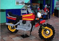
Photo Link: http://jandan.net/2006/12/13/insanely-cool-and-complex-balloon-art.html

When referring to the word ephemeral, we are talking about something that is not meant to last forever. Some forms of art, in this case the motorcycle balloon, would fit the idea of ephemeral. In creating ephemeral art, people usually do it for the purpose of joy, knowing that after awhile, the design would disappear.
Above is an image of a motorcycle made with the use of balloons. It uses the balloon colors of black, yellow, white, red, orange, and grey to create a real-looking motorcycle. It also exhibits a variety in shape and sizes of the balloons, in which roundish balloons were used to create the wheels, the headlight, etc, while cylindrical balloons were used to give variety to its structure to form the body of the motorcycle. There is a variety of structure going on in this art, coming altogether to form a structural image of a motorcycle, which  must be the world’s lightest motorcycle.
The artist may have enjoyed the process while creating this piece, wanted to achieve some sort of feeling by finishing it, like a sense of accomplishment, or just wanted to make it for fun. But why he/she created this, only the artist will know. Each piece of balloon that makes up the motorcycle could pop anytime, which will then make the motorcycle an incomplete art, until if fully vanishes. But luckily with the invention of cameras, we are able to save and capture images of this short lasting artwork.
Ephemeral art wants us to appreciate the artwork in its present moment. This artist, I assume, used a great amount of time creating this artwork, knowing that it wasn’t going to last forever. Although it’ll disappear after a while, the artist will know that it was once there. Even though it will disappear from the surface, the mental image of it, like memories, will still exist. Any art that is meant to last only a short time is termed ephemeral, and because the design disappears after a while, it encourages people to appreciate it even more at that moment. Every design in society should be appreciated because designs represent the hard work of people, who may have spent a long time to create something that lasts forever, or something that lasts only a short time.

Creativity From Without

Photo link: http://hi.baidu.com/sammylin/blog/calendar/200703/index/1


                   Creativity is everywhere around the world. Generating creativity may involve observing, imagining, or thinking, as one combines it with other aspects of life to create something of uniqueness and bring joy to people. Some people generate creativity through inspirations, which can come from people, objects, nature, etc. Even coffee has its own artistic beauty that makes it enjoyed by the world. Above is an image of a cup of cappuccino, with a design using steam-milked foam. Cappuccino is a coffee drink with its origin coming from Italy. This cappuccino drink above was created by Sammy Lin, a well-known barista working in Bottega Del Vino (an Italian restaurant in New York City).
                In this cappuccino drink, the design shows an image of two pinnately compound leaves (or something similar), with the petiole of the leaves crossing one another. The leaf on the left is curved towards the left, while the leaf on the right curves toward the right. Coffee, one would assume, is darkish brown. But with added foam milk, it gives off a light brownish color mixed with the white foam milk. The color is beautifully established as one can see that the outer sides of each leaflet gives off a lighter color than the rachis, making it look alive and not just flat. The upper part of the cappuccino gives out a darker brown compared to the whitish brown color on the bottom, which looks like swirls. When looking at this drink, one would forget that it’s a drink and see it as an artwork.
                This cup of cappuccino brings out creativity filled with nature. It uses two simple colors of brown and white to create a cup of drink that is beautiful to the eye. Of course, there are many more designs of these out there in the world because creativity has no limit. That is why we see so much variety and diversity in the design society today in all aspects of life. When looking at the cappuccino design, I get a feeling of relaxation, or calmness, because of the smoothness expressed in the cappuccino. Not only does one get to look at its creativity, but one can also taste the creativity of this art.

Stone Soup

Image based off group project
On Tuesday, October 5 of 2010, I went outside with my group to create “Stone Soup.” The reason it’s called this is because of an old folklore that goes by the title Stone Soup. This story tells of how three soldiers and the villagers all chipped in a little food and created a party that was enjoyed by the entire village. What we did was similar because we all gathered some materials and created art that was enjoyed by all of us.
I don’t have a picture of it, but I used Paint (computer program) to create a general view of the art we created. Using a pole and tree that was already there, we wrapped red and pink ribbons around to create something like a web. The in the middle, we hung a white Styrofoam, which we had shaped into a bow tie. And on the bow tie, we put on decorations using paper, such as cutting circular shapes and rolling paper to create cylindrical shapes. From the ribbons, we also hung small white bow ties made from white ribbons, and also hung a plate with holes, on the tree and the pole. On one of the plates, we taped an origami crane. And on the pole, we hung a strap of tape with leaves of the nature. Then on the bottom, we tied to the pole and tree a blue fabric with fishes on it, cut from bottom to the middle so that the bottom would sort of move back and forth when the wind blew on it.
By using the creative process of thinking, looking, and doing, everyone is able to create something called art. Art can be made from any materials, and so one can construct artwork from scrap materials just like the villagers and soldiers did by each providing a little food to create their “stone soup.”

Sunday, October 3, 2010

Seasoning Soldiers

Image from: http://www.0532ts.com/html/toy/09520310525349961.html


In design, we often see objects that are transformed from something very original into a new concept of its own. The image of seasoning containers, for example transforms into "people," as they  are redressed as Chinese Qing Dynasty men. The original ones people may be used to seeing are little plastic or glass cups with a top. But these made use of every aspect of it by changing the cup itself into a body, the top into a hat, and the spear into a scooper, using the three primary colors. The focus of design in these containers is not the colors, but rather the concept of the design. It seemed to have given the containers life, transforming it into something that one would want to take another look at.
These seasoning containers are from the Italian Company Alessi, a well known house ware manufacturing Design Company. There are probably many other more seasoning container designs out there, but what is interesting is the simplicity of the design and how it incorporates a part of Chinese history. It would be enjoyable seeing these in my kitchen every day, knowing that these are little soldiers of the Qing Dynasty.
Design, as I see it, is unique, as it puts pieces together to create something with its own uniqueness and style. This is so with the seasoning containers, as they’re combined with the Qing dynasty men to produce a new design. After reading the article, “The Etymology of Design: Pre-Socratic Perspective” by Kostas Terzidis, I was confused about the term originality. He said, “If innovation leads towards one direction, then the search for originality leads toward the opposite. Innovation may be seen as a process of adding one more leaf to the tree, while originality can be seen as the process of adding one more root.” In this case, this design would seem to fit the notion of innovation because it presents the original containers in a new and unique way that’s different from all the other seasoning containers out there. Although the seasoning container is not original itself, the theme or concept of the container, I would call originality. 
Design in society can be something fascinating, or it can be something as simple as these seasoning containers. Seasoning containers are something we see in many kitchens, but design transforms the object to make it something more than just a container, just as design transforms the society.

Simple Design


Both Images from: http://www.architonic.com/pmsht/binary-niche-modern/1058728


Above are images of binary modern pendant lights, which were designed by lighting designer Jeremy Pyles. These lights possess a clear transparent glass in a roundish shape, in which inspiration comes from the concept of a womb. It ranges in nine different color, but the colors used are not the typical colors we know of. From left to right, the colors are crystal and sapphire.
When referring to design, many people look at its exterior first before thinking about anything else. But design is also a way of experiencing, about the expression of one’s thoughts or emotions. It’s a way its creator sends a message. Design exhibits many forms and is a never ending reach. Whether the design is simple or extravagant, each design has its specialty that’ll attract people in its own way.
What do the lights look like? I see a gloomy face, with the two light bulbs as the eyes and the bottom glass as the mouth. In these lights, Jeremy Pyles expresses a form of simplicity. The exterior designing is not fancy and is not intended to bring focus onto the exterior designing of the light itself. Noticing the simplicity of these lights, I searched it up online and read in a web page that they were suppose to bring a sense of comfort and relaxation to the person when actually using it. The sapphire light for example, will allow people to relax when sleeping. This idea, I like, because it emphasizes on the senses of the individual instead of just the outer design.
I won’t be able to know the exact feeling given by these lights because I’ve never actually seen one in reality, but its simplicity and effect are enough to make me take a glance at these binary lights.